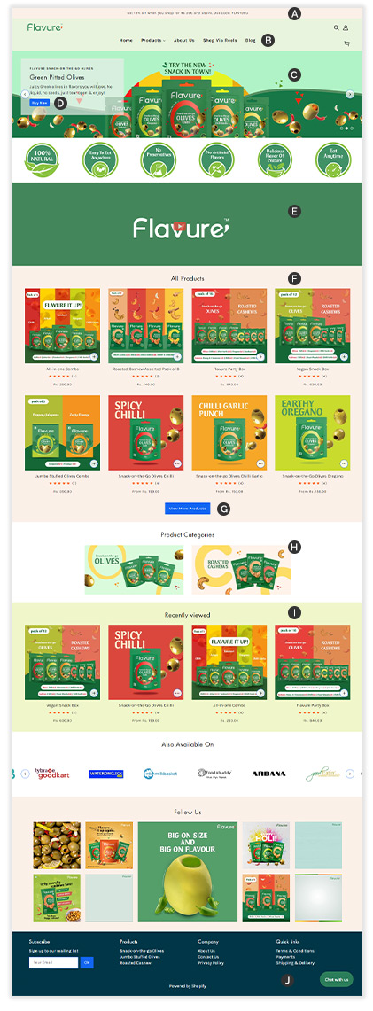
Flavure

UI redesign for an e-commerce website

Background

Having a great UI is critical for ensuring longer session times and improved conversions of visitors or sessions to orders. Flavure is a fun, healthy snacks brand whose e-commerce site (Shopify) was not optimized for conversions.

We made changes to the UI of the site to make it come close to well accepted standards. We share here two key pages where changes were made.

What we did
Home page - before
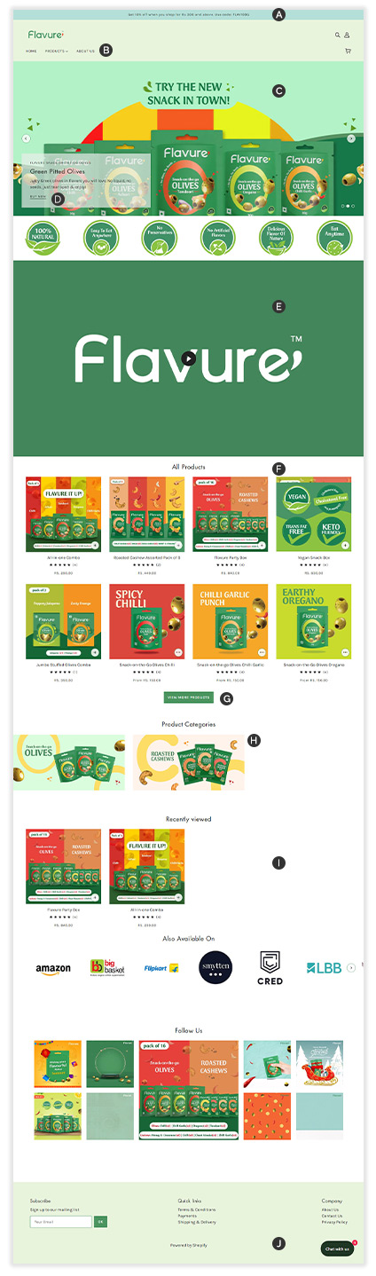
  • AColour changed (new colour pallette)
  • BMenu is centre aligned. Header height reduced a bit
  • CBanner oversized, size reduced by about 10%
  • DBlue link replaced by button
  • EVideo section oversized, reduced by 50%
  • FAll products section background colour changed (new colour pallette)
  • GGreen buttons changed to blue
  • HProduct categories section made centre aligned
  • IRecently viewed section background colour changed
  • jFooter section: New colour brought in. Product category links added to the footer.
Home page - after
Product page - before
  • AContent on right is shifted to left hand side
  • BProduct image is reduced by 10%
  • CBuy now section to left of product has been taken to the right hand side
  • DYou may also like section is taken above so user can also know about other products
  • ERecently viewed section background colour changed (new colour pallette) and taken below you may also like section
  • FWay to enjoy section is redesigned for better readability
  • GStars used for customer review are recoloured
  • HShare this section is place below
Product page - after

See our other work on e-commerce